Visual dashboard editor for Priceforge
Our app Priceforge is a data visualization engine as well as a price optimizer. Through its syntax, Envision offers a programmatic way to define the tiles that appear in your dashboard.
While it’s very handy to have an absolute control on the way numbers are computed, picking the colors of your tiles and composing the layout of your dashboard from the programming language itself is tedious. That’s why Priceforge supports a visual editor for your dashboards.
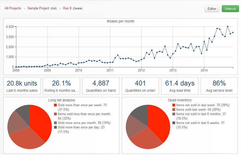
Let’s have a look at the sample dashboard provided by Priceforge:
Notice the Editor button at the top right of the window. If you click this button, it toggles the visual editor mode of Priceforge. All the tiles get dark and their respective positions - following Excel-like grid system used by Envision - appear on of each tile.
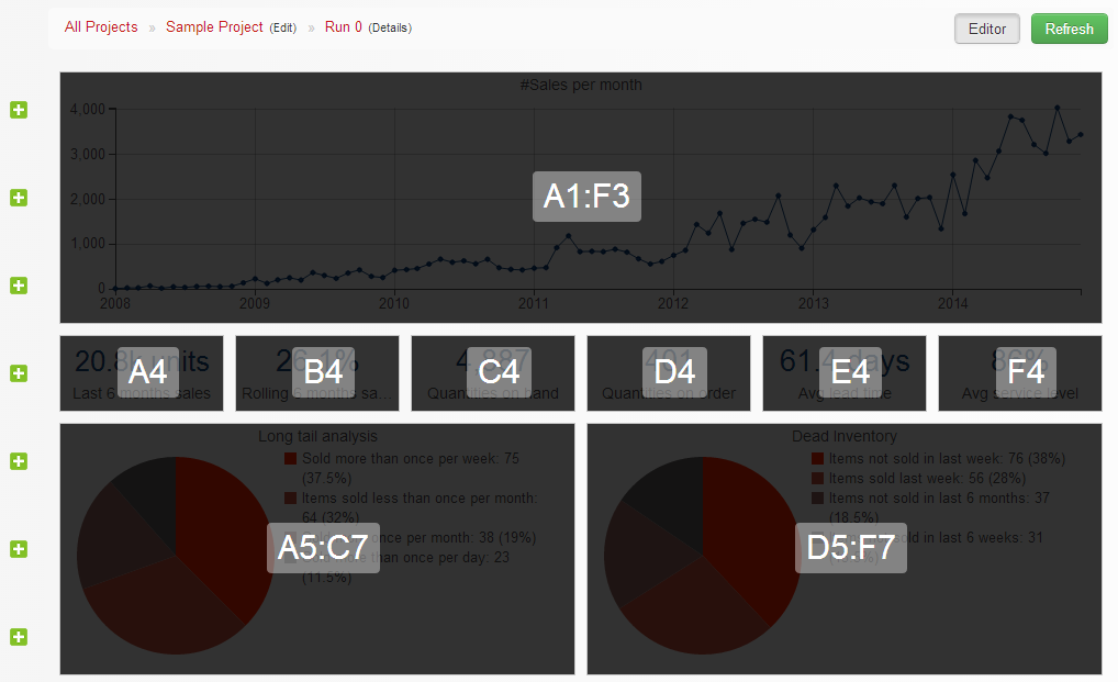
Then, while it’s possible to move each tile invidually, the visual editor offers a simple way to move all tiles up or down. Just click one of those green crosses on the left, and a new blank line is inserted.
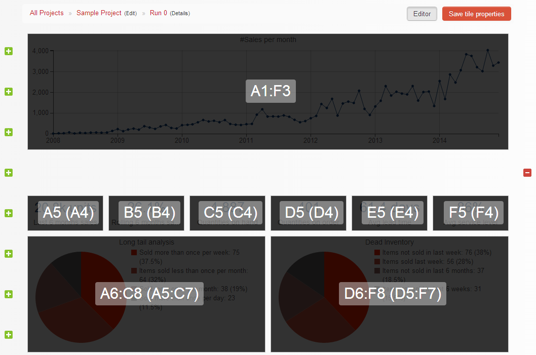
You can also remove this line blank line by clicking the red cross that now appears on the right.
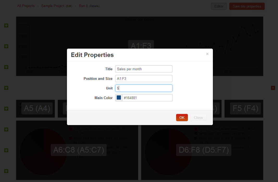
If you click a tile in particular, the modal dialog box appears. This box is titled Edit Properties as illustrated below. From this box, you can control the title, the position and size, the unit and the color of the tile. In practice, it’s the position and the color that are the most handy to be adjusted from the visual editor.
Once you’re done with your changes, don’t forget to save them by clicking the button Save tile properties that now appears at the top right of the window.